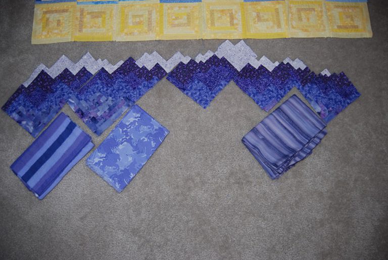
As I had feared, I totally ran out of material for the mountains.
When I first bought fabric, I chose an eighth or a quarter of a yard for just about everything. For things like the sky or the yellow, where I had at least 10 fabrics, this produced copious extra strips. However, where the mountains take up about a fifth of the quilt and I only had five fabrics, it wasn’t even close. Even worse, about two thirds of the mountains should have been the base batik, but I only bought an eighth of a yard of it. By the time I realized my mistake, the print was long gone.
So, I spent an evening carefully charting out strips to maximize each color, and then I had to go shopping for more. My first find was the one in the middle – bluer than the mountains, but under the florescent lights in the store, it looked feasible. On the way to the checkout from the cutting counter, I came across the print on the left. The stripes really weren’t ideal, but it had more brown tones, which worked better with both the existing batik, and the green/teal foothills.
When I left the store and saw the prints in daylight, both seemed like imperfect matches, so I went to a (more expensive) store that tends to have great batiks. There, I found the fabric on the right. It has the full range of dark purples, but is mostly a pink/brown/mauve, which actually works very well in the dark-to-light progression of the mountains, and the foothills really pop against it.
Such a relief!


These mountains and also the foothills look wonderful!! I can’t wait to see it put together.
Everything so far has looked great, but these mountain pieces left me breathless. I love it.